feOffset
Drop shadows are specifically mentioned in the w3c spec with the feOffset effect. The idea is to take an image and move it a little bit in the xy plane. If you want a drop shadow, you'll also want to make the shadow image black and fuzzy.
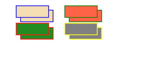
To get started, here's an example where we offset some rectangles then blend the originals on top of the offset image.
Note that the filter size is increased using width="150%" height="150%". The default values here are 120% and the default x and y are "-10%". The reason for this is that many filters use values from adjacent pixels to affect each other. By setting default values larger than the image, we can often forget about the importance of border conditions.
A basic example of 'feOffset'
<!DOCTYPE svg PUBLIC "-//W3C//DTD SVG 1.1//EN" "http://www.w3.org/Graphics/SVG/1.1/DTD/svg11.dtd">
<svg viewBox = "0 0 1100 400" version = "1.1">
<desc>
Filter example
</desc>
<filter id = "i1" width = "150%" height = "150%">
<feOffset result = "offOut" in = "SourceGraphic" dx = "30" dy = "30"/>
<feBlend in = "SourceGraphic" in2 = "offOut" mode = "normal"/>
</filter>
<g stroke-width = "5" filter = "url(#i1)">
<rect x = "10%" y = "10%" width = "20%" height = "20%" stroke = "blue" fill = "wheat"/>
<rect x = "40%" y = "10%" width = "20%" height = "20%" stroke = "green" fill = "tomato"/>
<rect x = "10%" y = "40%" width = "20%" height = "20%" stroke = "red" fill = "forestgreen"/>
<rect x = "40%" y = "40%" width = "20%" height = "20%" stroke = "yellow" fill = "grey"/>
</g>
</svg>
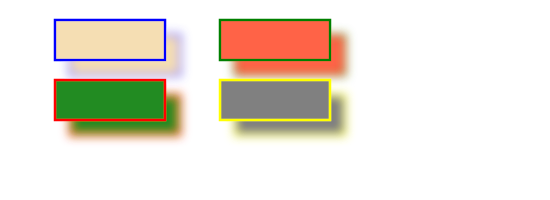
Now, to proceed with the drop shadow example, the offset images can be blurred.
<!DOCTYPE svg PUBLIC "-//W3C//DTD SVG 1.1//EN" "http://www.w3.org/Graphics/SVG/1.1/DTD/svg11.dtd">
<svg viewBox = "0 0 1100 400" version = "1.1">
<desc>
Filter example
</desc>
<filter id = "i1" width = "150%" height = "150%">
<feOffset result = "offOut" in = "SourceGraphic" dx = "30" dy = "30"/>
<feGaussianBlur result = "blurOut" in = "offOut" stdDeviation = "10"/>
<feBlend in = "SourceGraphic" in2 = "blurOut" mode = "normal"/>
</filter>
<g stroke-width = "5" filter = "url(#i1)">
<rect x = "10%" y = "10%" width = "20%" height = "20%" stroke = "blue" fill = "wheat"/>
<rect x = "40%" y = "10%" width = "20%" height = "20%" stroke = "green" fill = "tomato"/>
<rect x = "10%" y = "40%" width = "20%" height = "20%" stroke = "red" fill = "forestgreen"/>
<rect x = "40%" y = "40%" width = "20%" height = "20%" stroke = "yellow" fill = "grey"/>
</g>
</svg>
Okay, I really broke this out in to one more step so you could see that little coloured glass effect.
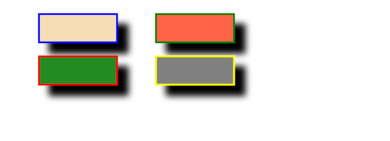
Now let's make the shadows black. The shortcut for this is to use the Alpha channel for the blur instead of the entire RGBA pixel. Treating it as a colour would probably make more work for the client's machine.
<!DOCTYPE svg PUBLIC "-//W3C//DTD SVG 1.1//EN" "http://www.w3.org/Graphics/SVG/1.1/DTD/svg11.dtd">
<svg viewBox = "0 0 1100 400" version = "1.1">
<desc>
Filter example
</desc>
<filter id = "i1" width = "150%" height = "150%">
<feOffset result = "offOut" in = "SourceAlpha" dx = "30" dy = "30"/>
<feGaussianBlur result = "blurOut" in = "offOut" stdDeviation = "10"/>
<feBlend in = "SourceGraphic" in2 = "blurOut" mode = "normal"/>
</filter>
<g stroke-width = "5" filter = "url(#i1)">
<rect x = "10%" y = "10%" width = "20%" height = "20%" stroke = "blue" fill = "wheat"/>
<rect x = "40%" y = "10%" width = "20%" height = "20%" stroke = "green" fill = "tomato"/>
<rect x = "10%" y = "40%" width = "20%" height = "20%" stroke = "red" fill = "forestgreen"/>
<rect x = "40%" y = "40%" width = "20%" height = "20%" stroke = "yellow" fill = "grey"/>
</g>
</svg>
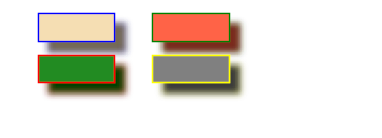
Here's an example of treating the shadow like a colour. I use the 'feColorMatrix' effect to transform the colours in the offset image closer to black. I'll give a little more on the 'feColorMatrix' effect in a different section. Here I'll just say that the three values of '0.2' in the matrix all get multiplied by the red, green and blue channels. Reducing their values brings the colours closer to black (black being 0).
<!DOCTYPE svg PUBLIC "-//W3C//DTD SVG 1.1//EN" "http://www.w3.org/Graphics/SVG/1.1/DTD/svg11.dtd">
<svg viewBox = "0 0 1100 400" version = "1.1">
<filter id = "i1" width = "150%" height = "150%">
<feOffset result = "offOut" in = "SourceGraphic" dx = "30" dy = "30"/>
<feColorMatrix result = "matrixOut" in = "offOut" type = "matrix" values = "0.2 0 0 0 0 0 0.2 0 0 0 0 0 0.2 0 0 0 0 0 1 0"/>
<feGaussianBlur result = "blurOut" in = "matrixOut" stdDeviation = "10"/>
<feBlend in = "SourceGraphic" in2 = "blurOut" mode = "normal"/>
</filter>
<g stroke-width = "5" filter = "url(#i1)">
<rect x = "10%" y = "10%" width = "20%" height = "20%" stroke = "blue" fill = "wheat"/>
<rect x = "40%" y = "10%" width = "20%" height = "20%" stroke = "green" fill = "tomato"/>
<rect x = "10%" y = "40%" width = "20%" height = "20%" stroke = "red" fill = "forestgreen"/>
<rect x = "40%" y = "40%" width = "20%" height = "20%" stroke = "yellow" fill = "grey"/>
</g>
</svg>